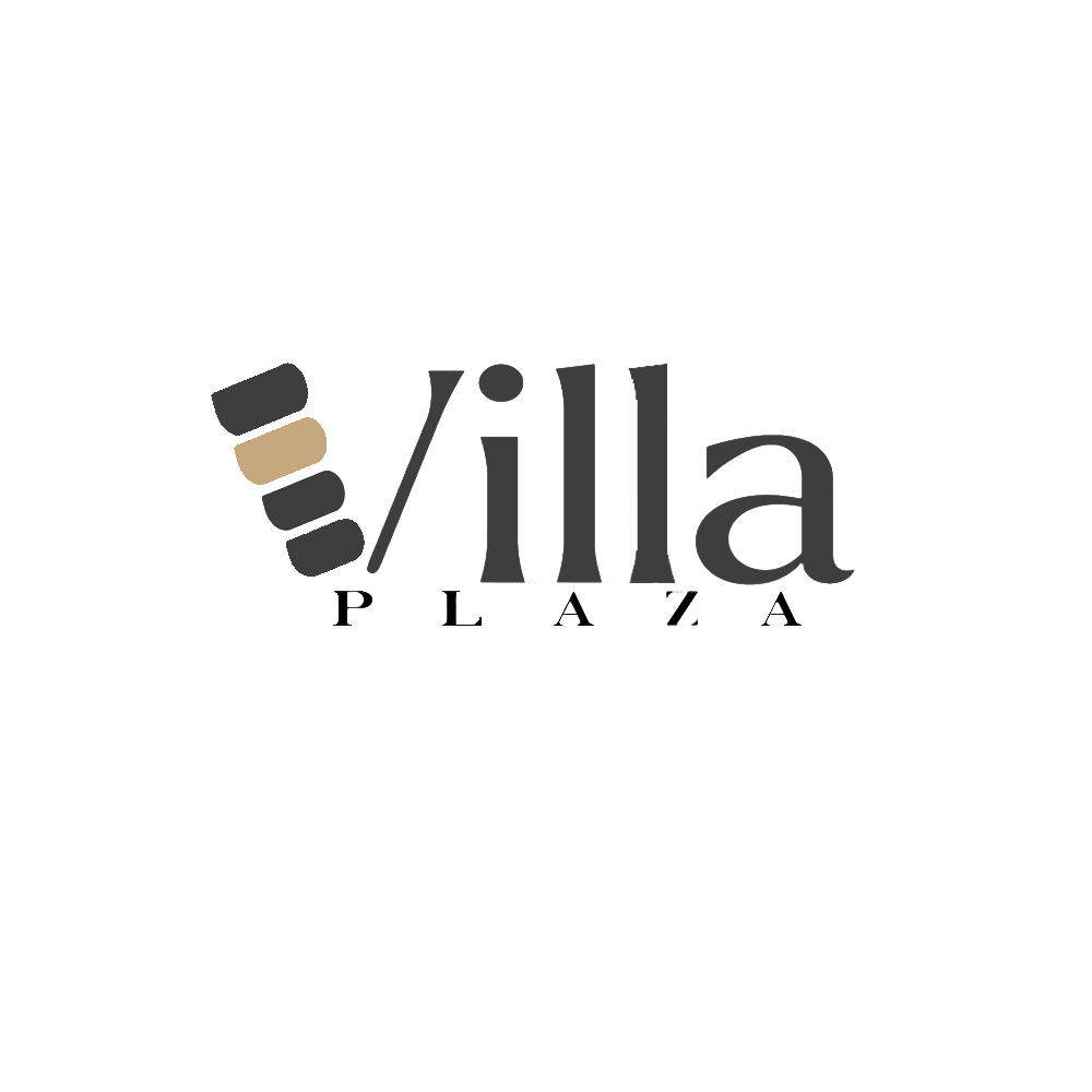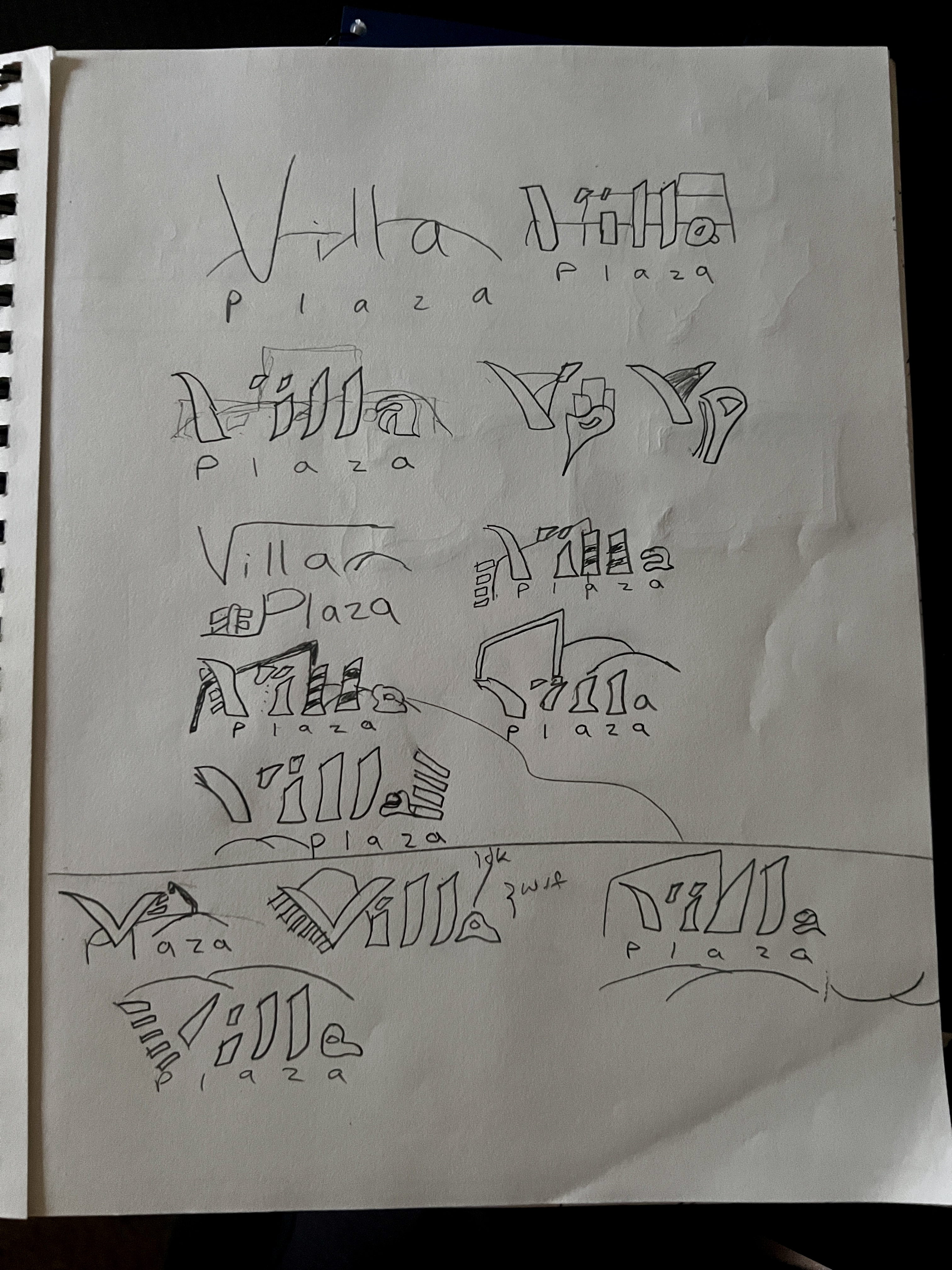
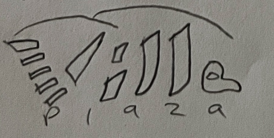
Villa Plaza is a constructive building agency that helps assign new business owners advantageous establishments. I asked Angelica, the owner (and family member), five questions. Two questions focused on the design aspects, the inclusion choice of color, and competitive designs; the remaining three concentrated on the business's long and short-term missions. Initially, I started the sketches by connecting the available buildings in the plaza with sleek modern typography. No color was in mind when drawing the sketches, only focusing on achieving a contemporary design. Once I decided on the logo to continue, I started using Adobe Illustrator to construct the shapes in the V. Capturing the essence of repetition, proximity, and alignment as the shapes decreased in size. Typography: Inspired by the sleek text shapes of the album cover, Blond, designed by Wolfgang Tillmans, yet not using an italic shape, keeps boldness. Lastly, Angelica presented a choice of two colors: walnut and copper. I presented both and had her pick which one she liked the most.
Although the logo's success prominence aided in cards, posters, ads, and billboard designs, the completion of the project should’ve presented with more compassion. Angelica’s design team followed with spacing issues in PLAZA, and the a in Villa contorted after post-design in Photoshop (likely due to conversion of SVG to JPG). The contortion and spacing issue was resolved with further tweaking. Furthermore, I was not aware of how the branding presentation of a logo should also be accommodated with conceptual designs such as suggested color schemes, variations of the logo when presented on a card or poster, exact typography to aid the design team, and other marketing constructs (merch, banners, etc.). However, the experience will not go to waste, and Angelica was delighted with the Villa Plaza logo design.